The flexographic printing process is inherently tough on small type. Press settings, anilox selection, artwork, and mounting tape all play a role in how small type is reproduced on the substrate. Accurate and legible printing of small type is especially critical for applications such as pharmaceuticals and food packaging. In this blog post, we'll take a look at some of the problems that can contribute to difficulty when printing small type, so you can keep your small type "on point!"

Prepress Considerations: Trapping / Font Selection
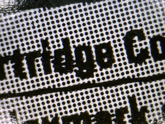
Trapping: When artwork is created by the designer, trapping isn't always taken into consideration. While the goal may be to consolidate information onto a limited number of separations, sometimes the location of small type is overlooked, and a screen can interfere (see image A). A small white stroke applied to this small type would have kept things cleaner and more legible.
Font Selection: Although this one is up to the designer, it's worth mentioning. In some applications, such as food packaging, the font is specified by a governing body (the FDA, for example). Ensuring compliance can be simplified by utilizing prepress software tools. Catherine Haynes explains further in her 2-part series, Mind Your Graphics.
Press Considerations: Anilox Selection / Impression / Tape Selection
Anilox Selection: Choosing the proper anilox for a given printing condition is critical for clean printing. Small type is easily filled in by over-inking, so you must test your limits and know where the breaking point is for each anilox and type size. The best way to test these combinations is with a banded anilox test. A banded anilox is engraved with multiple volumes and screen rulings. Running this roll with a positive/reverse type target will provide an array of results, arming operators with the knowledge of where the breaking point is for each combination, therefore avoiding surprises and costly downtime on live jobs.

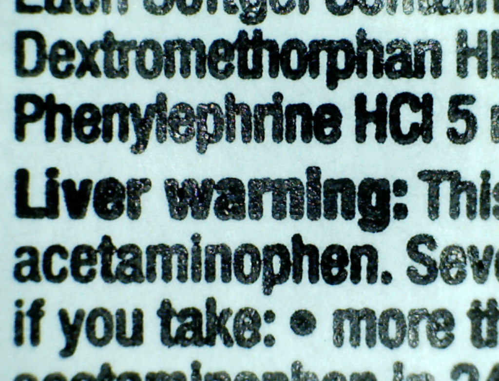
Impression: Setting impression is always crucial for legibility of small type. When over-impressed, type elements can fill in, run together, become larger overall (image B). Kiss impression is always the best choice - but what if the small type is on the same plate as a large solid that requires a bit of extra squeeze? Consider trying a flat-top plate such as MacDermid LuX ITP. The sharp shoulders formed by these types of plates will allow for a little more impression latitude when needed, reducing the overall gain and preserving readability.
Tape Selection: Just as tape can affect dot gain in screened areas, it can affect small type. When a hard tape is used to print a dense solid area, any small type on that plate will also be affected. Consider using a combination tape (medium-firm) when small type elements appear on plates with large solids.
In conclusion, utilizing prepress tools and press optimization are both key to printing the best type possible in your process. Rely on your suppliers' resources, such as APR's Technical Solutions Group, to provide the right solutions for your needs. If you would like more information, please contact me at [email protected].
