
SpotOn! is a powerful pressroom and prepress tool for managing to GRACoL, G7 and SWOP specifications.
You’ve invested in utilizing the G7 methodology on your presses, but now you have no way to know if you are hitting those specifications on a regular basis? Are you ready to really track and control your printing and proofing processes? Then SpotOn! is the tool you’ve been looking for.
SpotOn!™ is an easy-to-use process control tool with a powerful visual dashboard for tracking on-going press and proofer conditions. SpotOn! makes it easy for any print shop to test and generate charts showing the consistency of their printing and proofing processes. By adding a 29-patch control strip to press sheets and scanning it with an i1™ spectrophotometer, SpotOn! allows you to achieve and maintain optimum results to GRACoL® and SWOP® specifications. SpotOn! monitors presses and proofers for:
- Solid ink density variations
- Ink Solids and Overprints compared to ISO standards
- G7 Neutral Print Density deviation
- TVI (dot gain)
- Gray Balance deviation
- Average Deviations over time
- Density to ΔE Trends
- Density to NPDC, TVI Trends
SpotOn! software is easy to use. You do not have to be an engineer or a press expert to use this tool and understand what the reports are telling you. Plus, by monitoring the printing process, you will be able to maintain tight tolerance during press runs to produce higher quality products with less re-do's.
Once you’ve used SpotOn! and you have some trending data, you can use it as a vendor validation tool as well. SpotOn! can help identify trouble with inks, can tell you how new blankets are performing compared to the previous ones, compare quality of printing on different types of paper and more. SpotOn! can also pull reports by operator or shift, making it a valuable tool for employee evaluations to validate if operators are meeting shop standards for printing.
SpotOn! can help you produce more consistent results, match proofs better, reduce waste, and improve customer satisfaction.
Graphs
Primaries Graph
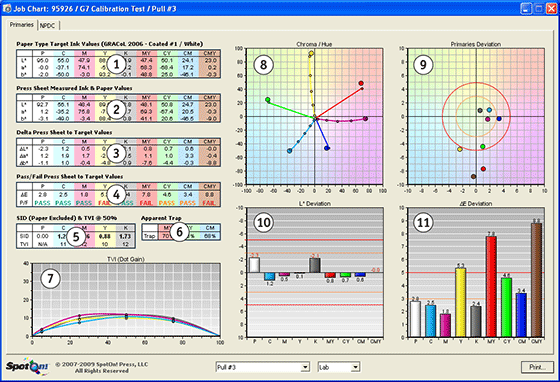
- Target Data Ink & Paper Values – This table displays the values for the current Target Data set in the Job Information screen. The chosen setting is displayed at the end of the title in parentheses along with the chosen Meas. Backing.
- Press Sheet Measured Ink & Paper Values – This table displays the measured values for the current Pull being displayed.
- Delta Press Sheet to Target Values – This table displays the difference (delta) between the Target Data Ink & Paper Values (1) and the Press Sheet Measured Ink & Paper Values (2). The Target Values are subtracted from the Paper Values to arrive at the numbers displayed.
- Pass/Fail Press Sheet to Target Values – This table displays the deltaE76 values comparing the Target Data Ink & Paper Values (1) with the Press Sheet Measured Ink & Paper Values (2). PASS or FAIL are displayed based on the tolerance setting in preferences for the deltaE value. The default setting for the deltaE tolerance is 5 and 3. With the default setting a deltaE of 5 and above is a red FAIL. A deltaE between 3 and 5 is an orange PASS, and a deltaE less than 3 is a green PASS.
- Solid Ink Densities & Tone Value Increase – This table displays the Solid Ink Densities (SID) for each process color relative to paper (-paper) using Status T filtration. Also displayed are the Tone Value Increase (TVI, aka Dot Gain) values for 50% using the Murray-Davies formula.
- Apparent Trap – This table displays the Apparent Trap values for the overprints using the Preucil formula.
- TVI All – This graph displays the CMYK TVI curves from 0 to 100% at 5%, 25%, 50%, and 75%. The graph is smoothed between data points and uses the Murray-Davies formula to calculate the TVI values.
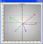
- Chroma/Hue – This graph displays the relationship between the CMY inks plus overprints and the Target Data. The a* and b* values for the Target Data are the large dots. The lines are the a* and b* values for the inks and overprints. These lines radiate out from white paper to solid ink.
- Primaries Deviation – This graph displays a more precise picture of the relationship between the CMYK inks and overprints to the Target Data. The center of the graph is the target for each color. The data points show how far each color is from its target and which way it has to move to get to the target.
- L* Deviation – This graph displays the L* delta values from the Delta Press Sheet to Target Values (3) in a visual graphic manner.
- ΔE Deviation – This graph displays the deltaE76 values from the Pass/Fail Press Sheet to Target Values in visual graphic manner.
NPDC Graph
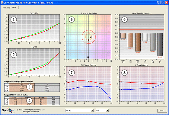
- CMY NPDC – This graph displays the press CMY gray scale density values to the CMY Neutral Print Density Curve (NPDC). The red line is the press gray scale densities and the green line is the desired NPDC.
- K NPDC – This graph displays the press K gray scale density values to the K NPDC. The red line is the press gray scale densities and the green line is the desired NPDC.
- Target Densities – This table displays the target densities for the 1/4, 1/2, and 3/4 tone values for both the CMY and K gray scales. These values are useful when reading gray target patches on a press sheet color bar, as they help the operator maintain tight neutral print density (NPD) and gray balance tolerances while running the press.
- CMY Target CIELab Values – This table displays the target Lab values for the 1/4, 1/2, and 3/4 tone for the CMY gray scale. These values are useful when reading gray target patches on a press sheet color bar, as they help the operator maintain tight neutral print density (NPD) and gray balance tolerances while running the press. They are only useful if the press operator is using CIELab instead of density to control the CMY neutral gray scale.
- Gray a*/b* Deviation – This graph displays the a* and b* values for the 25%, 50%, 75%, and 100% CMY gray patches. The center of the graph is the target for each patch. The data is modified for the paper color of the press sheet using the IDEAlliance® G7™ formula for calculating the effect of paper color on neutral gray.
- NPDC Density Deviation – This graph displays the density variance between the press sheet and the NPDC for both the CMY curve and K curve. This is another way of looking at the values displayed in the CMY NPDC (1) and the K NPDC (2) using density values.
- CMY Gray Balance – This graph displays the a* (red) and b* (blue) values for the CMY gray patches from 0 to 100% at 5%, 25%, 50%, 75% and 100%. The graph is smoothed between data points. It shows the effect of paper white on the neutrals and how well the press is printing CMY gray. The data is displayed as absolute values, so paper white is not subtracted from the data.K
- Gray Balance – This graph displays the a* (red) and b* (blue) values for the K gray patches from 0 to 100% at 5%, 25%, 50%, 75% and 100%. The graph is smoothed between data points. It shows the effect of paper white on black at various percentages. The data is displayed as absolute values, so paper white is not subtracted from the data. Since there is no way to make changes on press to this graph besides changing the color of the paper, it is used as an indicator of the effect of paper color on neutrality. In other words, this graph shows the best possible a* and b* relationship between gray and the paper being used. The CMY Gray Balance (7) cannot be any closer to pure neutral (0,0) than this graph.
Trending Graph
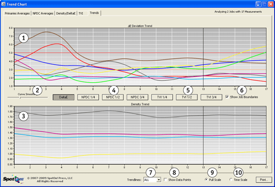
- ΔE Deviation Trend – This graph displays the deltaE values for the inks and overprints as compared to the tolerances set in preferences. The y axis displays deltaE76 values. To display this graph, press the DeltaE button.
- Curve Smoothing – This slider adjusts the amount of smoothing applied to the curves. Sliding it to the left renders the trend line with less smoothing and to the right more smoothing.
- Density Trend – This graph displays the density of CMYK ink over time and is helpful when evaluating any of the graphs displayed above it. The y axis displays density.
- NPDC Buttons – These buttons toggle between quarter-tone (1/4 or HC), mid-tone (1/2 or HR), and three-quarter-tone (3/4 or SC) graphs. The data displays the CMY (brown) and K (gray) NPDC density deviations from the dotted target lines. The y axis displays density.
- TVI Buttons – These buttons toggle between quarter-tone (1/4), mid-tone (1/2), and three-quarter-tone (3/4) graphs. The data displayed is the CMYK tone value increase (TVI aka Dot Gain). The y axis displays the TVI percentage.
- Show Data Points – Checking this checkbox will display the data points associated with the polynomial curves. It is usually left off to keep the graphs less cluttered.
- Pull Scale – This radio button changes the x axis to graph the data using even increments over time. This is the default choice and should be used in most cases.
- Time Scale – This radio button changes the x axis to graph the data using the time the data was recorded. This would only have value if the actual time the measurement was taken was at the actual time the press sheet was run.
Download - SpotOn! Product Brochure, English 1MB
Download - SpotOn! Process Control Brochure, English 1.1MB